- Welcome to the future of Compulse!
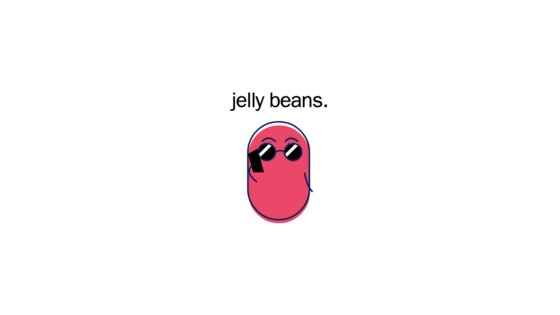
- Jelly beans. Presenting today, a new concept for our company website that will make us stand apart from both our competitors and creative agencies here in Baltimore.
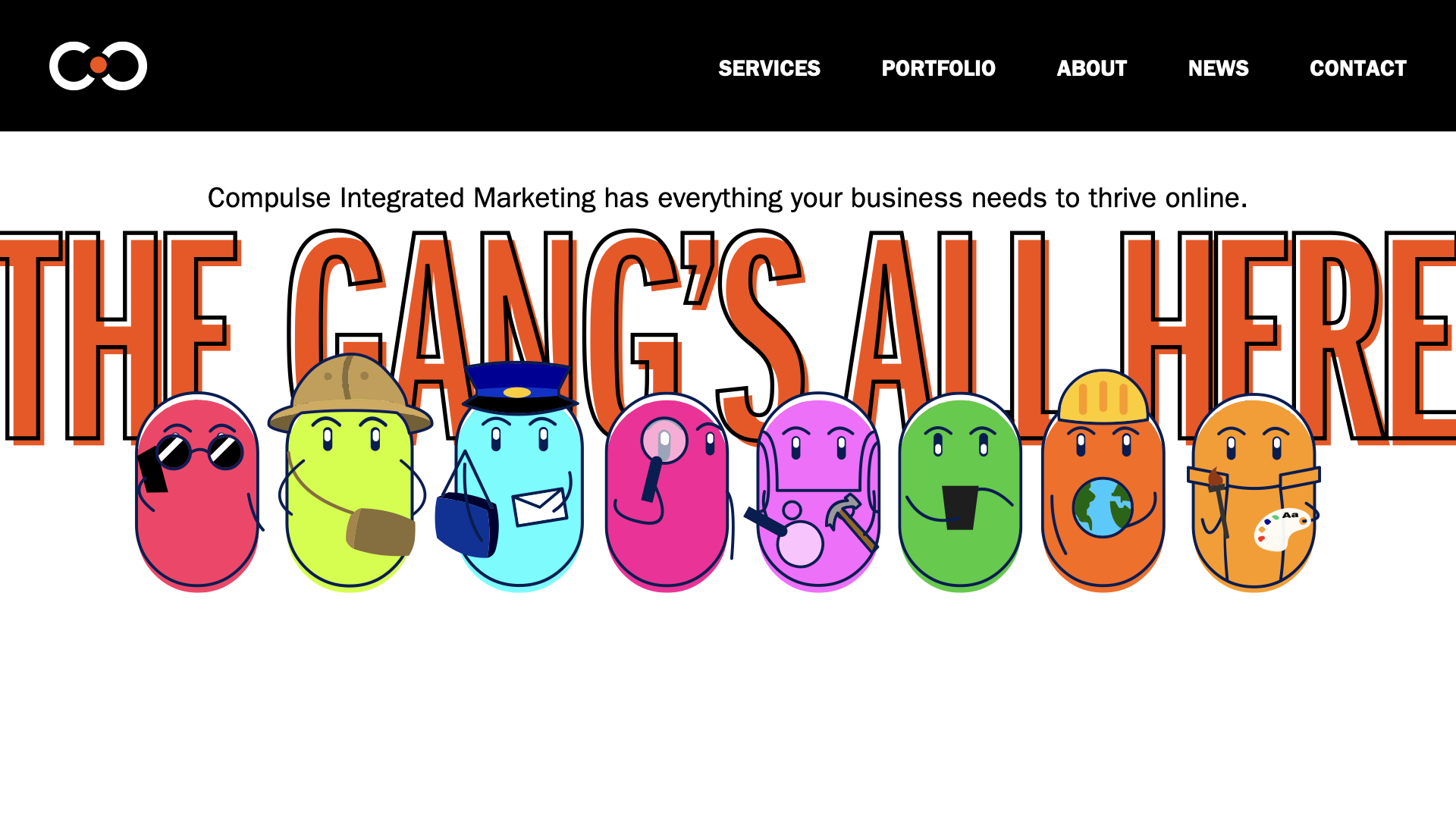
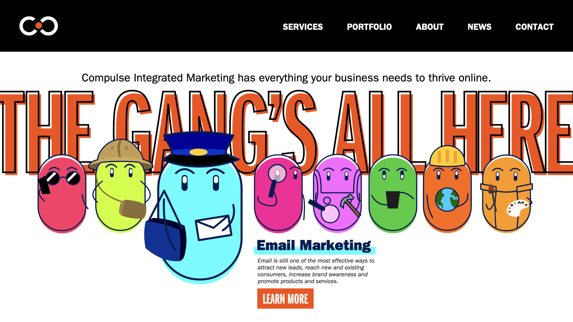
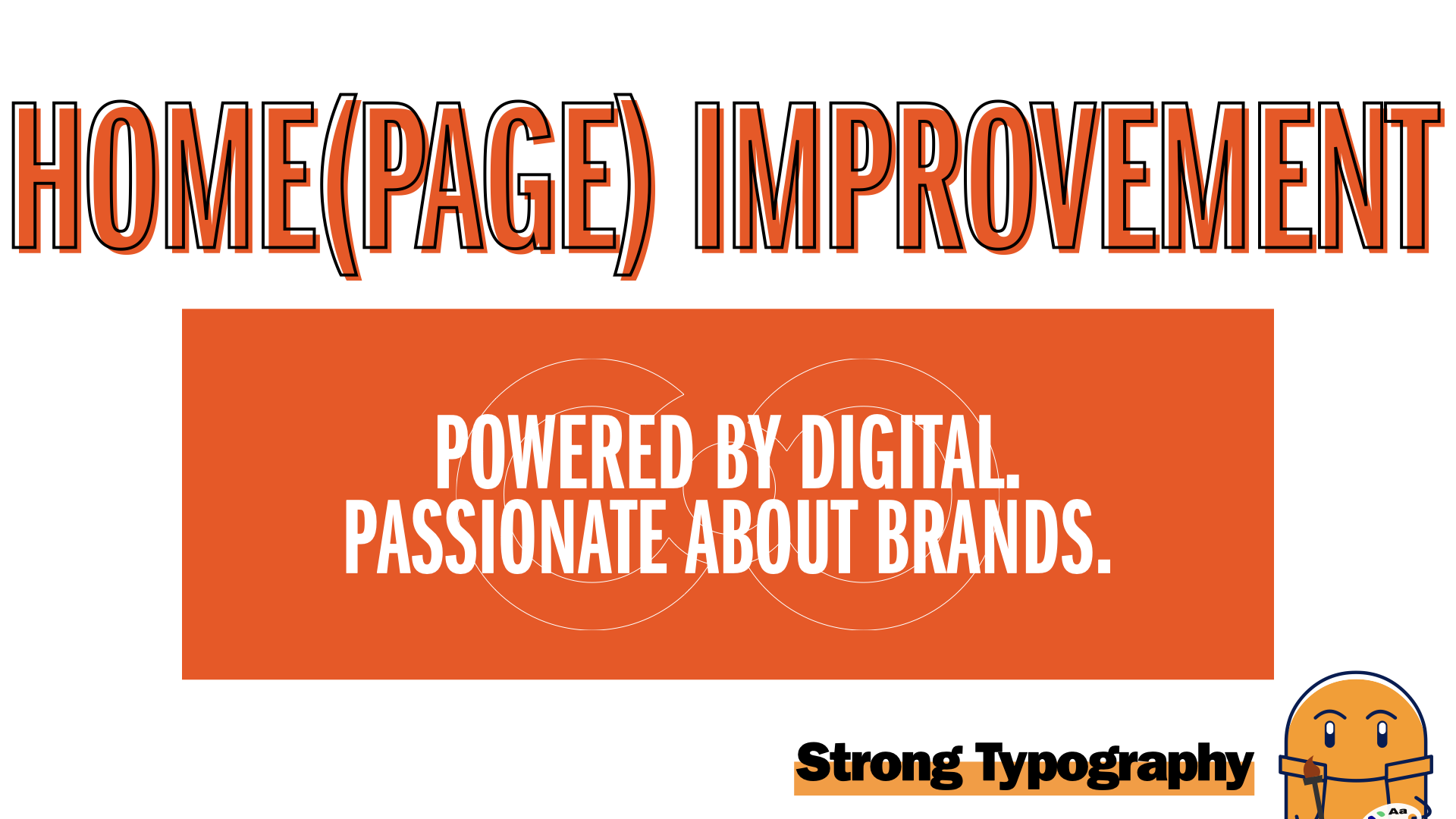
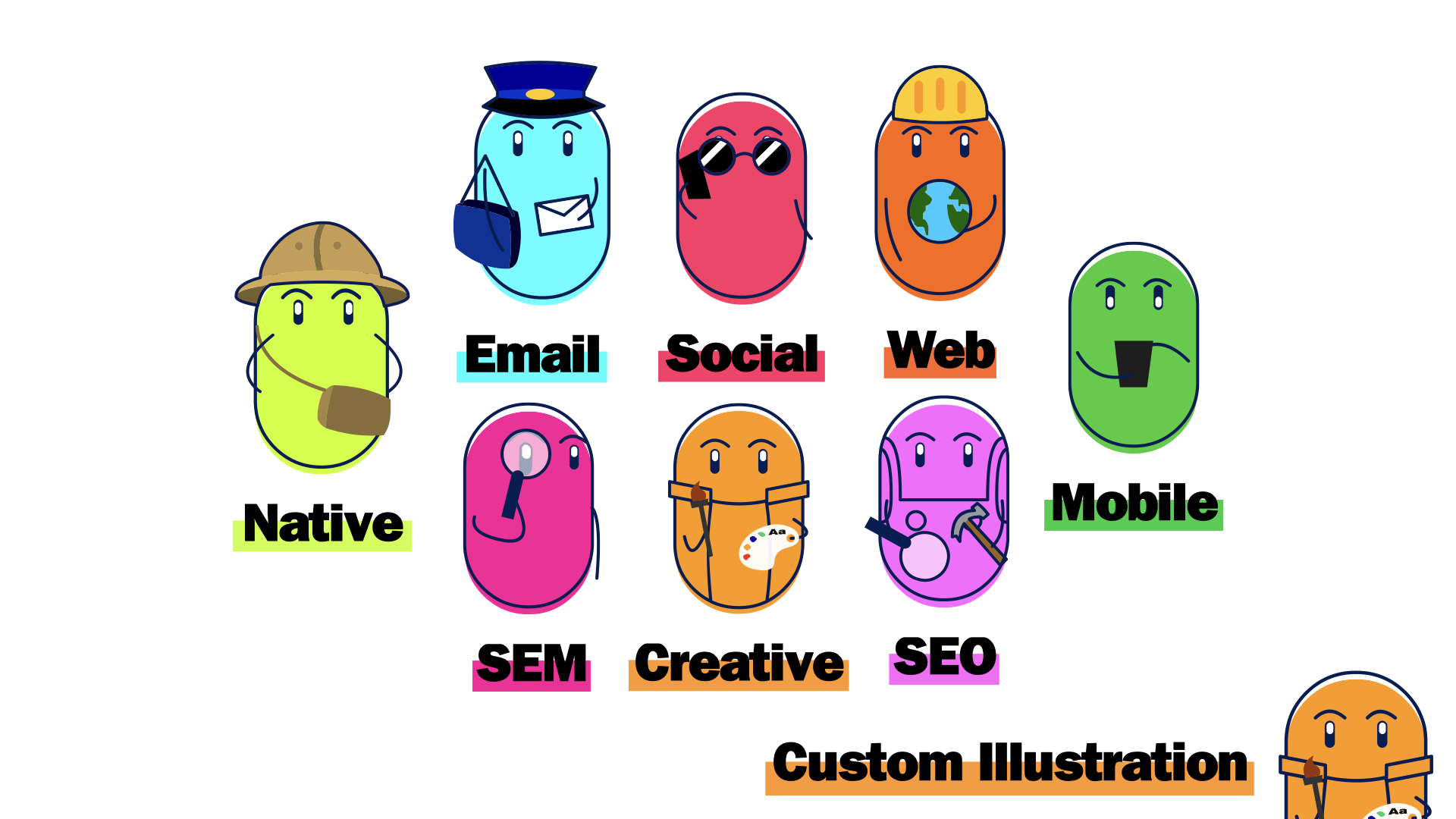
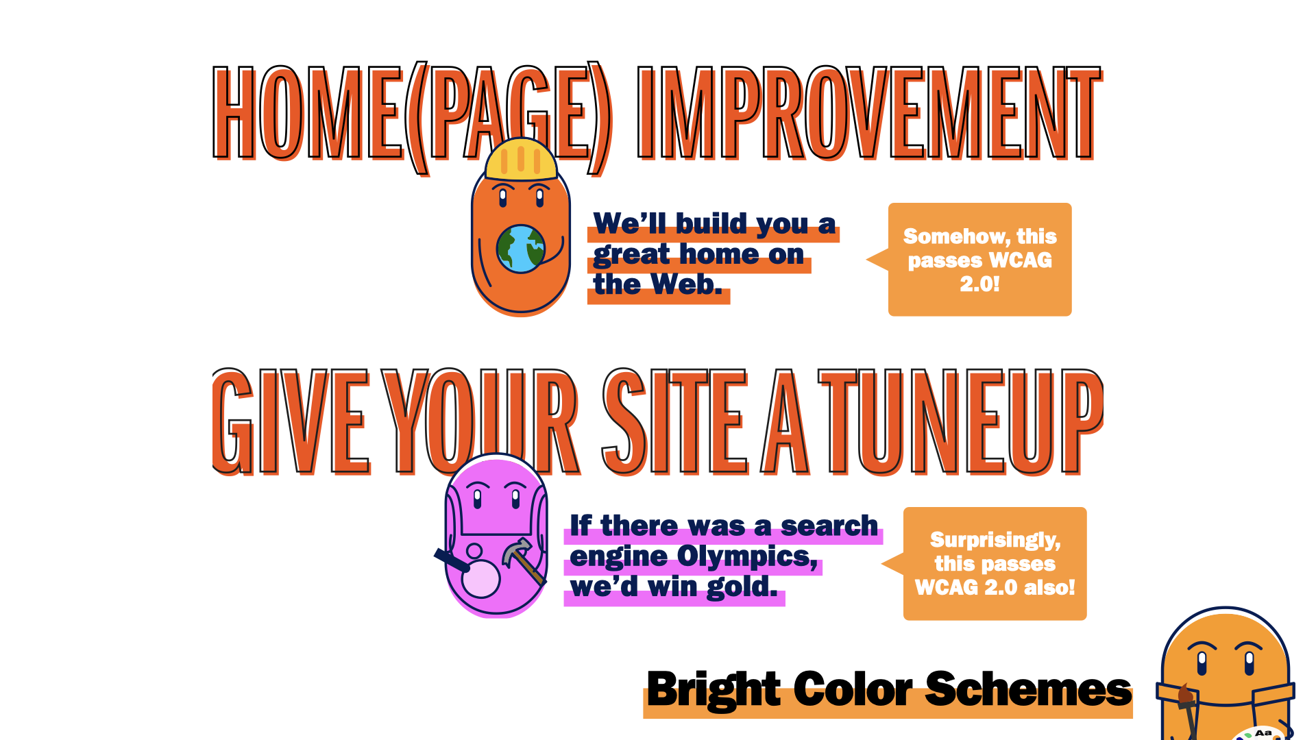
- Instead of hackneyed, generic stock photography, strong typography and cute, custom-drawn jelly bean mascots that represent our various teams and services greet our uses. Interacting with them is both fun and informative.
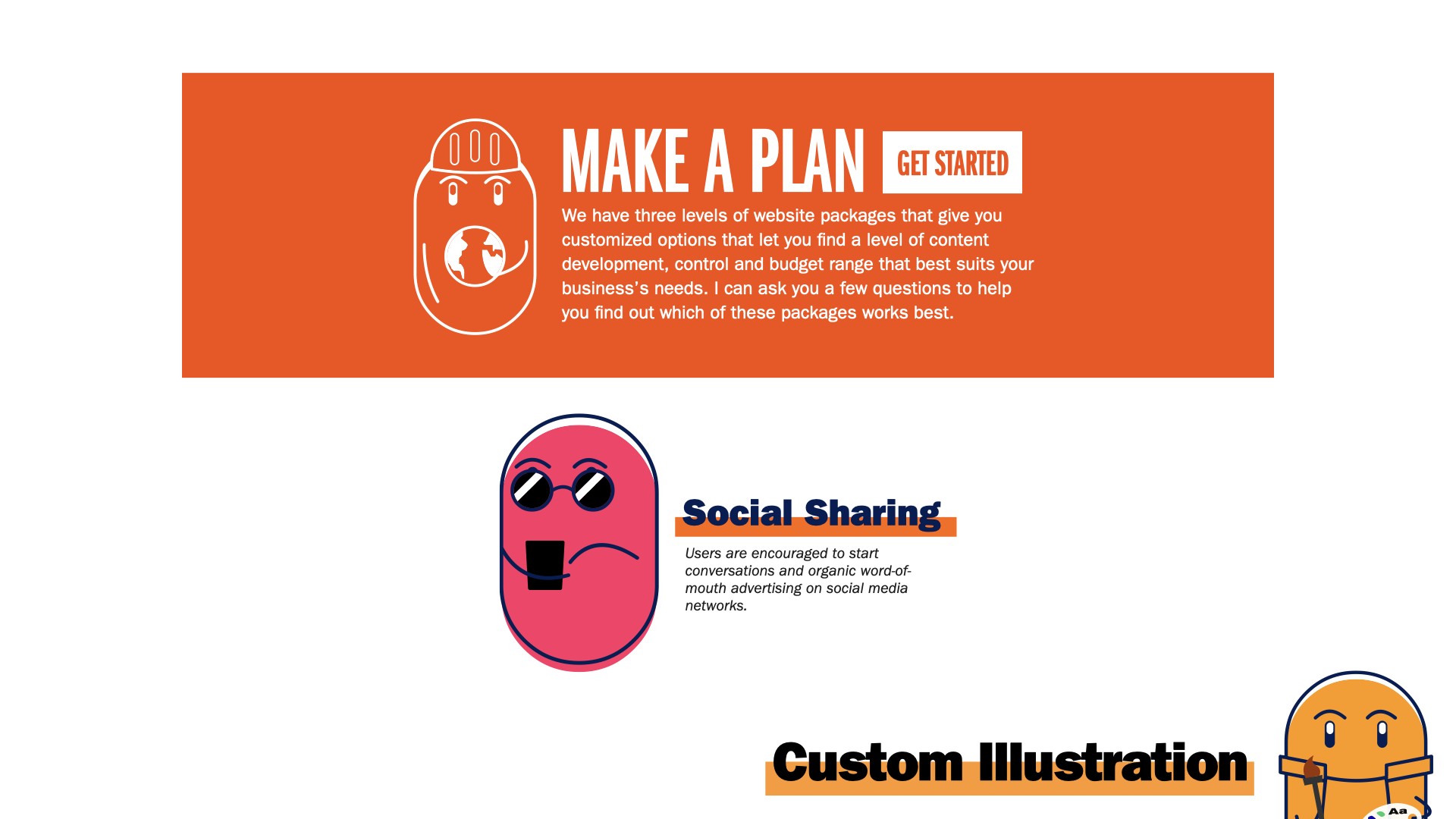
- Scrolling down the homepage, bright but legible callouts break out the action and lead viewers’ eyes to important information.
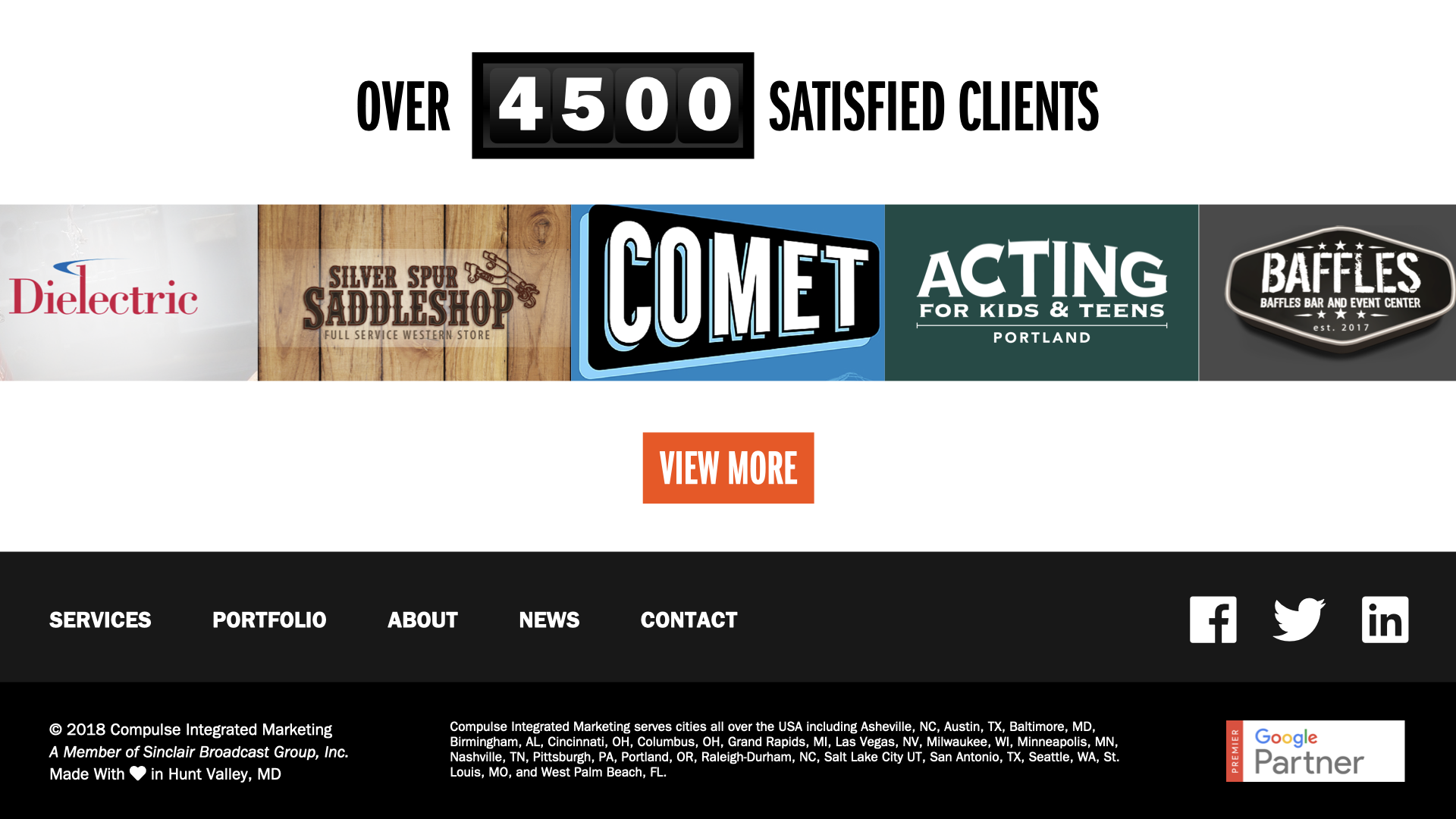
- At the bottom of our page, a rolling speedometer-style ticker showcases how many clients we’ve worked for and a scrolling cavalcade of previous projects slide across the screen. More detailed postmortem-style profiles share details of our successes.
- I’ve put a lot of thought into the style and branding of our website, in an attempt to establish a corporate identity that not only reflects what we do as a company, but who we are as a group of people.
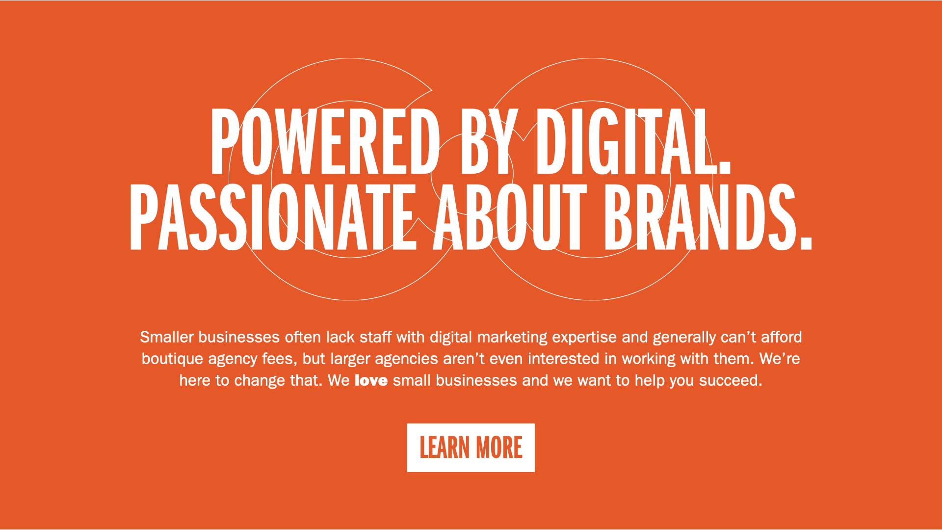
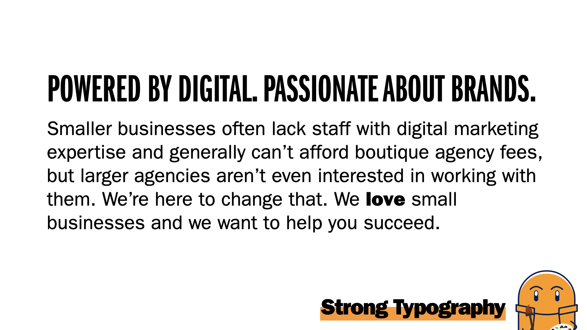
- Strong, bold typography in large sizes and bright colors draw the eye straight to them.
- Three typefaces, all in one family, have been chosen to minimize loading times without sacrificing readability or emphasis.
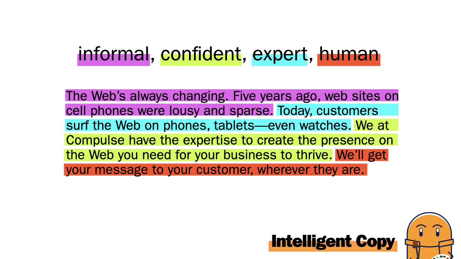
- Note here the contrast and readability in this sample paragraph. Bold text pops out without looking vastly different, as a reader would emphasize a word in bold when reading aloud.
- Our mascots, these jelly beans, are visual, custom, drawn in-house, and are colorful! Putting these custom mascots on our website in lieu of stock photography do several things: they allow our site to have a personality, they showcase our creative strengths, they provide visual cues for some of our more esoteric services and they mirror the fun personalities we have as a team.
- These jelly beans are used all over the site: sometimes, they’ll lead the user in interactive quizzes to lead customers to services or products that are right for them, or other times they’ll be used to showcase the inter-connectedness of our products, by appearing in other parts of the site.
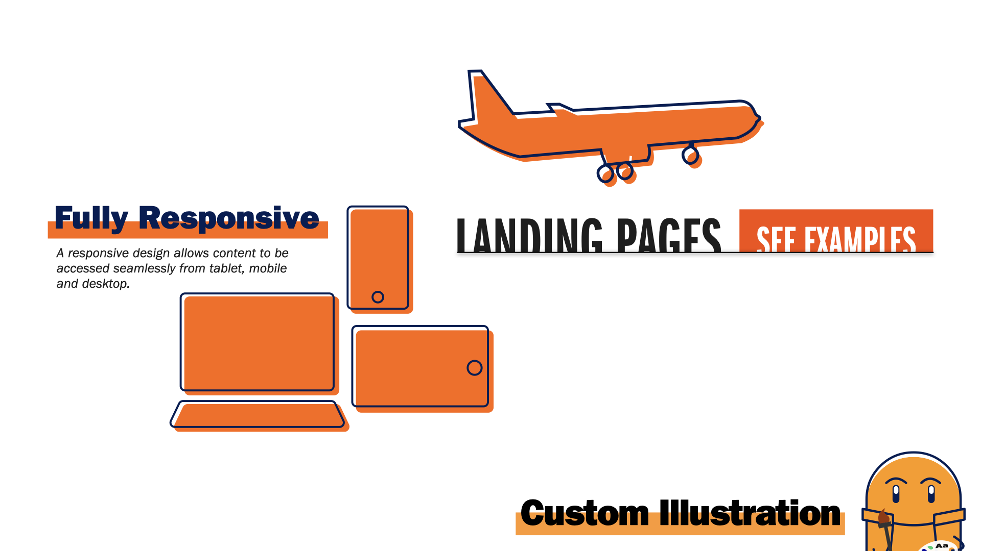
- All the iconography is custom-designed in house. None of the iconography is taken from stock photography websites. We are a creative agency—we’re going to be creative.
- Every section of the site will have bright color schemes to give users a visual anchor to the many services we provide. Highlighter-style chunky underlines emphasize sub-titles, and each part of the site is designed with WCAG 2.0 accessibility in mind.
- I’ve also taken copywriting into consideration, with the tone of the website’s copy displaying four main traits: informality, confidence, expertise, and the human element. Take for instance this sample paragraph: we start with informal, casual discussion, with words like “lousy” and contractions. Then, we showcase our expertise, our knowledge of trends. We then display our confidence in our abilities, then we finish with a human reassurance that what we want is for our users to succeed.
- We need a website that showcases our strengths and makes us stand out from the rest of the pack, and I feel that my design is the direction we need to go. Thank you for your time.
